Cover illustrations for this DIY industry is one of those things that seems elusive and difficult and hard to obtain. Especially for artists like me whose body of work is mostly black & white with or without gray wash applied. Most RPG books want a cover that is full color, and grabs attention with a vibrant splash. To be honest in my opinion color is not my strong suit, I feel as though I have a lot to grow when it comes to knowing the right shades, hues, and mixes of traditional media. Not to say that I cannot learn it, but with my steady schedule of black & white work rolling in there just isnt enough time in the day to completely set myself to learning that part of my craft.
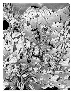
I dont do a lot of color work, and that translates into not doing a lot of cover work either. There are rare instances like +Joe Salvador's Beyond the Ice Fall seen here

where I was able to do a minimal coloring to an already rendered black & white gray wash illustration. Adding in the blue was done digitally, in Clip Studio Paint EX and was fairly easy to do as detailed in a previous blog.
However, when +joseph browning asked me to help him out with a cover, and render it in the "retro" feel of the 1970's "salmon" inspired TSR modules I had to go through a bit of a learning curve. Here is what Joe wanted his cover to resemble:
I cannot even begin to tell you how they did this in the 1970's, printing technology was low tech, and programs like photoshop and Clip Studio did not exist, I am certain that it was produced in black & white but from there the process probably had a ton of steps to go through in order to get it to look this way. If someone has some insight on this I would truly like to know. I doubt very much that it was an easy process. Quick searches on the google didnt help either and I have already detailed how little time I have in the day.
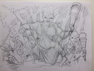
So, with trepidation and a bit of excitement I decided to do some experiments on Joe's project. First I had to get the basic drawing done, and here you can see the roughs starting to come together.
The cover was going to be a group of adventurers; warrior, archer and magic-user all about to be set upon by a trio of cloud giants. You can see in the roughs, that I was working out the giants, and some of the characters here. The position of them would change, and they would get more details as I went to the final pencils.
This one is a WIP of the back cover, the pencil details on the vine were time consuming, and the effect in pencil I think was better than in ink, but I was committed at this point.
Here I am playing with placement, the main cloud giant is in place, and for the most part has undergone all of his iterations to the final. I have two of the main adventurers in the foreground, and am starting to work the trees in. I loved the position of the female archer, and the cloud giant. I was stumped a bit on the magic-user in the foreground (usually I would want to have the foreground hashed out earlier) but I wasnt quite sure where exactly to put the guy.
You can see here that I am starting to think about darks and lights, and keeping the leaves of the trees very basic so that I could surround the heads of the giants and the top of the illustration with that "Salmon" color to frame the action a bit.
I have also jotted in the other two cloud giants, finding that they were going to be down hill from the party, and thus only their head and shoulders would be shown. This was a design idea, as well and figuring how much time I would have to get the three giants in the image. having them mostly blocked out, and larger in the background gave the feeling of their immensity in contrast to the figures in the foreground.
Here is the final pencils I have placed out magic-user in the middle, and he balanced the illustration quite well. It was here that I started to realize that scenes in which the main characters are facing away from the viewer allows them to feel like they're part of the action. Maybe I am a bit slow on this fact, but I have never really been told much about layout in art, and I am constantly learning this craft. Since this piece I have done a bit of research on layout and panel design and there are a ton of theories including; the golden ratio, rule of thirds and many others. All of them have a place in art, but most of them say that illustrators can and do break the rules all the time to great effect. It is good to know theory, but in the end it is the eye of all creators that makes or breaks the illustration in my opinion.
Starting to block in the ink. Everything to this point is all done with traditional media. 4H pencils for layout, H pencils for darkening in the final pencils, and now ink well and brush to add the blacks. I use rapidiograph black india ink and windsor & newton series 7 brushes, a #2 (for fine line and #4 for blocks of ink. I often use sakura micron pigma pens as well, but usually only for final details (which we dont see here yet).
More blacks are added, starting with the foreground and working backwards. If I were to draw a parallel to painting, inking is done in reverse "usually". With painting most artists will dot in the background and then work forward, which makes sense in painting because typically paint lays over paint easily and layers well. With ink, there is no layering, and all of the details on top have to be worked out before those in the background, there are some artists that use white-out or white gouache to good effect for bringing back white areas, but it is by far easier (for me) to start in the foreground and work backward.
Here is the final inks, the hue comes from the camera and the lighting in my dining room where my studio is set up. All of the blacks are dotted in and the final details are complete.
After this I will clean up the pencil lines, tighten up the blacks (as inevitably the eraser will take up the ink in places) and scan it in with my Epson WF-7610 scanner. (a word on the scanner, highly recommended, as it accepts artwork up to 11 x 17, it is easy to use and relatively inexpensive.)
Scanning it in as a black and white drawing, I then have to change the color of all of the black lines. This starts out by changing them to blue.
Beyond this point the digital process begins, I am an amateur at best when it comes to digital, and so the methods that worked for me are by no means the best ones out there.
I kinda sort of like this color. When you follow the steps detailed this is the default color in Clip Studio Paint.
By clicking on the red check mark and then changing the color from blue to your chosen color (in my case a redish orange) you get this.
I have already started to dot in the blacks using the marque tool, and have begun to add in some tone.
In this one I have pretty much finished the toning, and have added all of the highlights and dark areas. The process may be easier for others, but at the same time I came away from this part of the project with a deeper understanding of color (at least Salmon/red), and using a digital media to add finishing touches, and change hues. I am not going to lie that the process was frustrating but I believe it turned out quite well.
While I am not an expert at color, or digital media, I think I accomplished what the publisher wanted, and came away with a deeper respect and understanding of both true digital artists and those who work almost entirely in color.
In the end I still have a lot to learn, and I am grateful to Joe for giving me the opportunity to experiment on this project.
Here is the final cover.
Head on over to RPGNow and pick this thing up to support Joe!
Thanks for looking, and comments are always welcome.


