Time flies when you are having fun that is for sure...a week went by and left me in the dust. Onto the blog.
Last time we left off with the & Magazine character studies I presented you with Kantner and Grace in Character Studies II, and before that we talked about Kaukenen and Joey in Character Studies I, well now that & Magazine Issue 11 is published you can run over there and download it for FREE and check out all of the other artwork that is in there. Lots of fine fellows volunteer their efforts to that publication dedicated to the 1st Edition of the Worlds Most Popular Role-Playing Game.
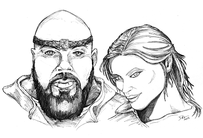
This week we will view the illustration of Creech & Signe.
 |
| Copyright Del Teigeler 2015. |
Creech is a fletcher, and the bodyguard of his mistress Signe, who is a practicing thief when she gets a chance. See more in the pages of & Magazine Issue 11.
I started with Signe as I wanted to capture that elusive look, she is quite devilish with her grin, and I am please with the way she turned out. I drew her with a coyish look but hinted at an underlying mischief by having her look directly at us out of the corner of her eyes. Her facial features are attractive, and I gave her a simple pulled back cut to her hair.
Her best features in my opinion are her eyes and hair. Of all of the character sketches her eyes are the best, and her hair has a natural fall to it with the shades and highlights.
I probably could have done a better job forming her jaw and chin, they look a bit brutish, but give her a "I can take care of myself" look.
Again these sketches were combined in GIMP.
For Creech I wanted him to be directly facing the viewer, giving a look of "try it punk". His face is rounded with a bald head. The description actually called for "naturally" blonde but I didnt like any of the hair I put on him. Bald to me has a natural connotation of strength, unless of course there is a comb-over involved. I am fond of the braided headband, and if you look closely you can see that the motif is an arrow denoting his "fletcher" profession. I assume Signe stole it for him.
I really need to work on textile texture. Both of their shirts could have been better. I have seen some instructional vidoes on drawing texture. Maybe I'll check them out. I deffinately think I could have done better.
Creech's beard is one of his strong points, the article doesnt mention a beard so there is a bit of artistic license there, but I favored a strong "Gerard Butler 300" type for Creech. The heavy shading at the edges and "back" of the beard are pretty well done and force the front of the beard forward in the illustration as it is lighter.
Other than than his eyes may be a bit smallish...hmm.
Anyway, there is one more of these Character Studies before I show off some other artwork I have been working on.
Thanks for looking, comments always welcome.

No comments:
Post a Comment