Saturday, May 31, 2014

Crosshatch and Pencils

      Even though I mostly work in the Fantasy genre I do occasionally draw things for the simple study of certain aspects of drawing itself. I have to admit that this picture came from several years back, and forgot that I had even drawn it.

     Going back through the sketchbook is a good way to learn from things you did wrong in the past, and also helps you understand where you came from artistically. It allows you to see how you have progressed, the techniques you learned along the way, and the things you wish never to repeat.

     All of these are represented in this picture of a cowboy (though I have to admit, that I think I was trying to draw "The man with no name" from the Clint Eastwood films.) that I drew in 2011.
     
     This is a stylized drawing of the man for sure. I would like to break down the drawing piece by piece to get a better feel for some of the things I think I did wrong, what I learned looking back at it, and what I actually got right. 
     First, the overall composition isn't bad. We have a 3/4 view and a head and partial shoulder look at the man. His expression is blank, something that I admit I must improve on. His facial features are also a bit off, starting with the spacing of his eyes and the angle of his nose (Hey! maybe his nose is broke!), all the way down to his enormous "butt-chin". (What is it about the old west and conjuring these impressions of buttchinians!)
     I think I am most impressed with the hat (though small for his head), I rarely only lightly pencil things these days, using mostly inks and markers, but the fact that you can see the crinkles and folds and it actually looks three dimensional....WIN! Also I used a decent amount of crosshatching, I dont know if I perfected it with this picture, but I certainly got better at it. 
     You can see from this drawing that I still havenot perfected drawing hair. I find hair to be one of the more tricky things to draw, I used to try and draw every piece of hair, now I tend to use the shading approach, working in large black and white portions of the hair. (But more on hair later I am sure.) 
     In conclusion this isn't one of my best works, but I think I have shown that quick sketches of any subject matter will bring some improvement along the way. As an artist I always strive to improve with each drawing I do. Even if the improvement isn't noticed until I look back at earlier works. 

     Thanks for looking, keep drawing!
Friday, May 30, 2014

Inspiration

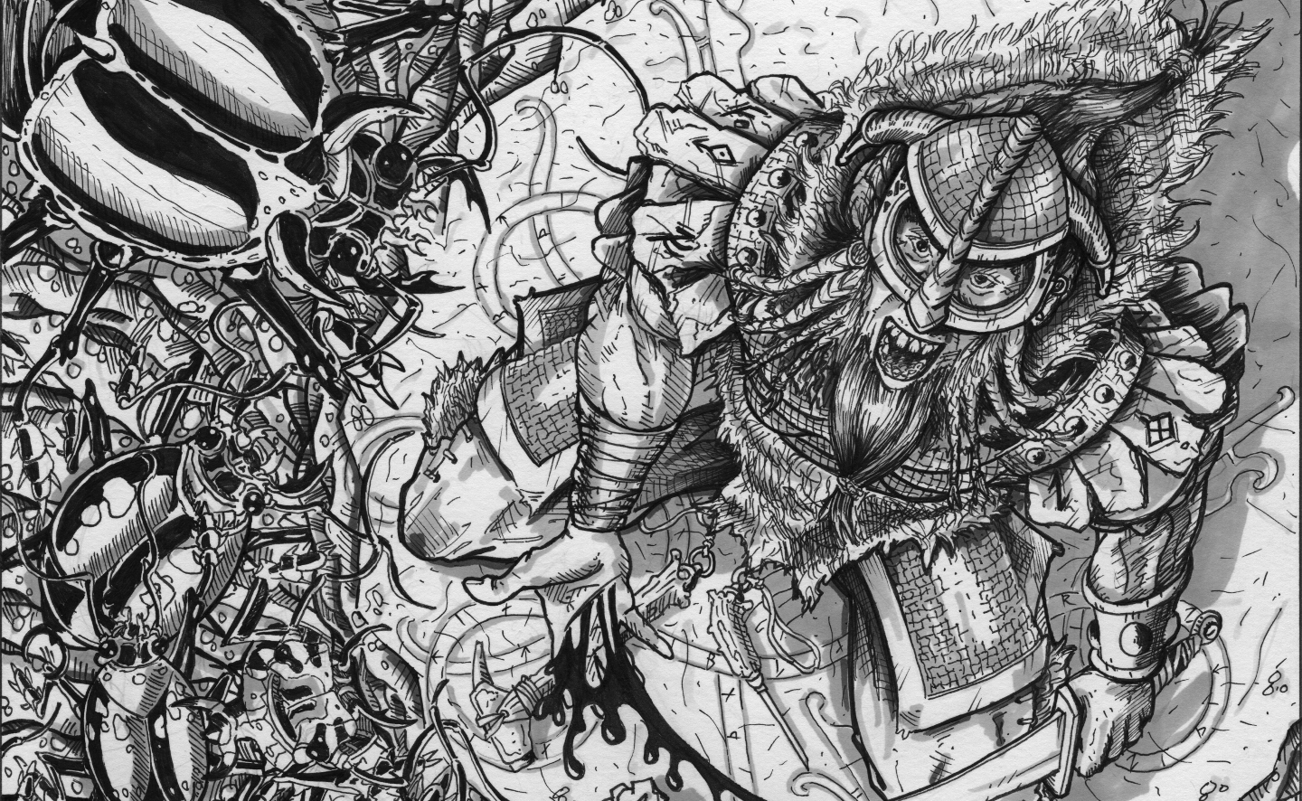
Over the years I have looked at the art of others for both inspiration and to learn from the things that they do with brush, pencil and ink. Every time I do a study of someone else's work I tend to learn something new. Today I would like to take a look at a study I did of Larry Elmore's "Norse Cleric" (at least that is what I am calling it...I am not sure of the official title.)

First I look at the original in the image below.

The cleric of the lower left specifically. Somehow Larry Elmore was able to capture the "human" aspect of this character. That is something that I strive for but rarely am able to do. Looking closely at the original illustration we have a bearded hammer wielding cleric casting some form of spell, his arm outstretched. The clothing flows naturally, and he is in a posture of "power". The composition is nearly flawless, the equality of lights and darks is what makes our eyes zoom in to the figure even though he is offset. The clothing flows around the form beneath giving us the feel of bulk without being overly expansive. 

Now for my version. 

First let me say that this is NOT a tracing (as I think many of you can tell),I simply drew side-by-side with the original, and drew what I saw. I think I captured the overall feel for the character, but somehow I am lacking still. This is a quick study obviously, and it was done several years ago. The ratio of lights to darks is deffinately off. While I feel that I was able to draw the posture of "power", and the overall composition was solid, there is still some improvement that needs to be made. My style shows through over Larry Elmore's, which is only natural (but maybe not such a good thing.)
You tell me. 

Learning lesson: It is okay to copy the artwork of another artist for quick study. Never claim it as your own, no matter how unique your version is. Tracing has it's place, but side-by-side illustration will often teach you more. 
Have a good day, keep drawing!

Thursday, May 29, 2014

If you are interested in seeing more of my artwork there are several places that you can view them.

mavfire.deviantart.com
https://sites.google.com/site/handdrawnartbydel/
www.and-mag.com

Thanks for looking.

If you are interested in commissioning art feel free to contact me.

First Blog Post!

Welcome to my blog. This is the blog of Del Teigeler, fantasy artist, and Art Director for & Magazine.

I have been drawing since my earliest memories, and have always been facinated by creatures and things of the fantasy.

I hope you enjoy my blog.

Thanks for stopping by.

Here is a piece I have been working on over the past several days. It is a Rosewood Golem, a creature created by Wesley Clough and will be published in the future in the pages of & Magazine. www.and-mag.com